In a world full of divisiveness, the color white has pretty much stayed out of the discourse. However, when Pantone, a leading source of color expertise worldwide, gave it top billing, the conversation quickly intensified.
This past December, this global color authority announced its 2026 Color of the Year: Cloud Dancer (PANTONE 11-4201), which it described on Instagram as a “lofty white neutral whose aerated presence acts as a whisper of calm and peace in a noisy world.”
While the announcement aimed to evoke elements of serenity, relaxation, and quiet reflection, the reaction has mostly been anything but. Instead, the internet has erupted in debate of whether white is a color at all. Allegations of sterility, blandness, and lack of creativity have piled up, which has led to a push for Pantone to explain its decision.
“It felt like an odd choice that the people who set the color chose the absence of color,” said Chicago-based interior designer Alison Besikof. “For many designers, I think that white serves as an anchor more than as a design element, so that makes it even more of a strange choice.”
In response to the criticism, Executive Director of Pantone Color Institute Leatrice Eiseman told The Washington Post that it was not a matter of “defaulting to white.” Rather, the shade is meant to signify a blank canvas “opening up new avenues and ways of thinking.”
“It’s not a pristine white, it’s not a technical white, it’s not a white that we think about when we came out of COVID, where people were looking for these very optically brightened white,” Eiseman elaborated. “This is intentionally a softer white, a white that is not bleached, a very natural-looking white.”
Since 1999, Pantone has selected a color shade that will represent and define the year ahead as well as serve as a prediction of the upcoming year’s global mood and culture. Pantone Color Institute members collaborate throughout the year as they track, analyze, and forecast design and color trends. They observe film production, art collections, new artists, fashion trends, design, popular travel destinations, and more, aiming to select a color that aligns with human emotions to offer comfort and inspiration.
The chosen color sits at the forefront of Pantone’s brand identity for the year to come, appearing in commercials and Pantone-branded merchandise, including Motorola smartphones, Command strips, Post-it Notes, Joybird furniture, and Play-Doh. Previous Pantone Colors of the Year include Mocha Mousse (2025), Peach Fuzz (2024), Viva Magenta (2023), and Very Peri (2022).
“A few years ago, Benjamin Moore chose Simply White as its Color of the Year,” Besikof recalled. “Coming from them, it felt that felt fine because they are paint company. Pantone is a color company that sets the color palette universally for fashion, for interiors, for everything. So, to pick a shade of white, when there is every color available, was weird. Personally, I feel like this is not where interiors are trending. In fact, we’re trending away from white kitchens and more towards color drenching, warmer tones, and textures.”
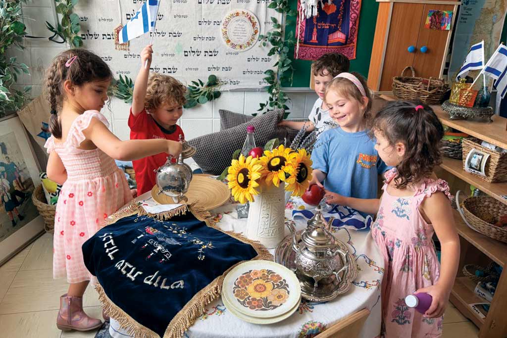
Instead, Besikof views white more as a backdrop to bring out colorful artwork and even highlight Judaica like Shabbat candlesticks, mezuzahs, ketubahs, and challah covers. “There are ways to bring in richness within white rather than doing stark white,” she explained. “For instance, if you love color, but are uncomfortable putting it on the walls, we can bring in really cool and interesting pieces, and a white background makes the art the star.”